We always to try to preach taking the long view when investing. Sometimes that is easier said than done. Particularly when the financial news media (CNBC, MarketWatch, Bloomberg, Fox Business, et al) feel that the only way to get ratings and advertising dollar is to cater to the short term perspective and fear. Their scrolls and headlines scream at us…What do you need to do TODAY to protect your portfolio! Amazing how many times they use the words plunge, triple digit drop loss and plummet when describing a simple -1% down day.
My personal favorite happened this February…

From our If it Bleeds it Leads post
But it’s no wonder they do this. Their market research is telling them ratings go up when markets go down.
I’ve always thought that this was at the detriment to investors. Essentially, these channels (and their websites) are meant for Traders, not Investors. So, I decided to take to twitter to see how other people felt (and maybe, just maybe get the attention of one of these channels to see if they would even consider it). Here was my tweet…
I took the liberty of redesigning @CNBC‘s market data tiles. Think this gives their viewers much more info. What do you think? @wesbury @MichaelKitces @jasonzweigwsj @behaviorgap @awealthofcs @charliebilello pic.twitter.com/OeploxPNqX
— Concentus Wealth (@ConcentusWealth) October 26, 2018
Was surprised by the response. It certainly struck a chord with people, particularly other professionals in our industry. They had lots of suggestions (scale it, add shading, index it for inflation, etc). Some even went so far as to create other versions. I think Michael Kitces summed it up nicely…
What would market volatility be like for investors if THIS was how news sites like @CNBC & @MarketWatch highlighted daily market volatility (relative to where investors stood over longer-term time periods as well)? h/t @ConcentusWealth https://t.co/tXCjkb3Sva
— MichaelKitces (@MichaelKitces) October 26, 2018
While all the suggestions were great, I wanted to present something that wasn’t a drastic change. Something CNBC could actually implement with their existing graphics, etc. Funny enough, even some of their own show hosts retweeted the tweet.
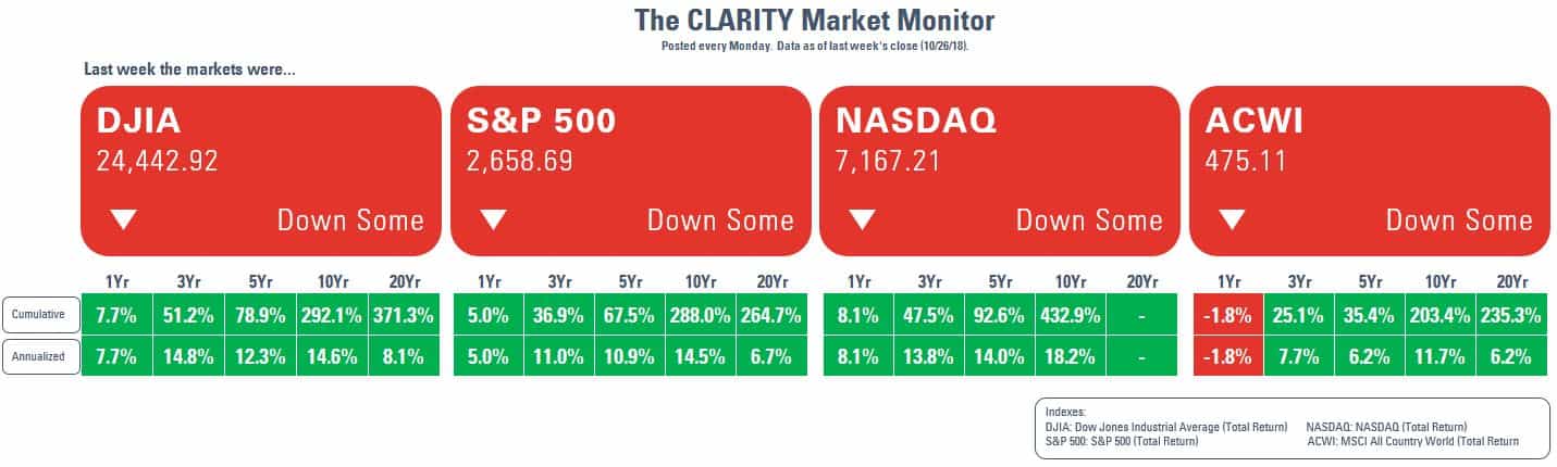
So, I’ve decided to take the matter into my own hands and create the “CLARITY Market Monitor” (aka the anti-CNBC/MarketWatch/Bloomberg Market Monitor).

I did make a few small tweaks to my original design (added annualized and 20yr #’s, added a global index). I also replaced the daily % changes with ‘down some’ or ‘up some’. I know CNBC would never do this, but hey, it’s my design. By the way, you’ll also notice there is no Year-to-Date (YTD) number. This is very deliberate. I believe YTD is relatively meaningless number. In January, it’s 30 days worth of return, while in November it’s 300+. How is that helpful to a long term investor? I actually think it is harmful.
I plan to update it and tweet every Monday. So, if you ever want to know how the markets are “doing”, just check @ConcentusWealth and look for it. I hope you find it helpful.
Leave A Comment